In the world of fashion, visuals speak louder than words—and nothing represents a brand’s personality more powerfully than a fashion logo. It’s more than just a symbol; it’s the face of a brand, the silent storyteller that communicates luxury, street style, elegance, or bold innovation within seconds. Whether you’re scrolling through social media or walking past a boutique, that small mark often decides whether you pause or move on.
Table of Contents
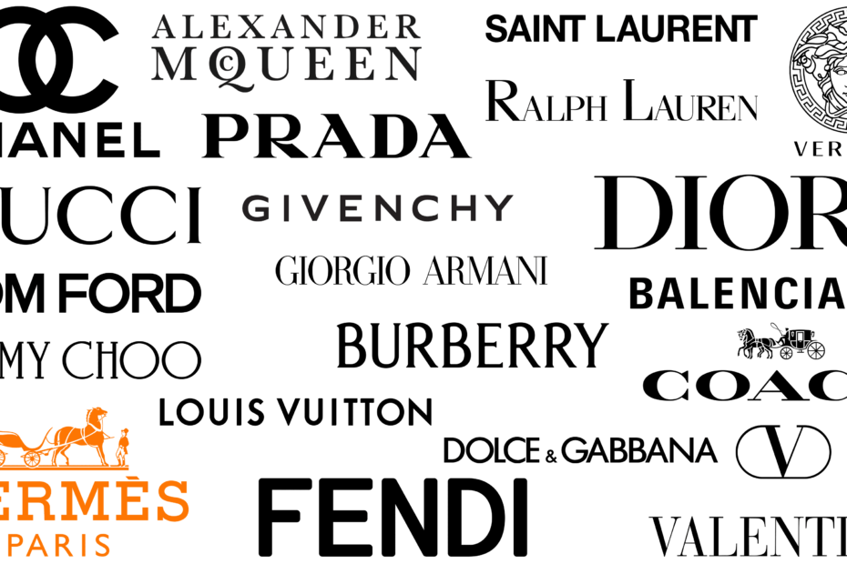
ToggleFrom global giants like Nike and Adidas to luxury icons like Gucci and Chanel, every successful fashion house relies on a distinctive visual identity that connects emotionally with its audience.
But what truly makes a fashion logo unforgettable? Let’s break it down.
The Role of a Fashion Logo in Modern Branding
A fashion logo is not just decoration—it’s a strategic branding tool. It builds recognition, trust, and emotional connection in a highly competitive industry where thousands of brands compete for attention daily.
When customers see a logo, they don’t just see design; they instantly associate it with lifestyle, values, and identity. For example, a minimal black-and-white mark might signal luxury and sophistication, while bold typography might reflect youth, energy, and street culture.
In today’s digital-first world, where Instagram feeds and online stores dominate, a strong visual identity is often the first impression—and sometimes the only chance—to win a customer’s attention.
Key Elements That Shape a Powerful Fashion Logo
Creating a memorable fashion logo involves more than picking a font and icon. It requires thoughtful design psychology.
Typography plays a massive role. Serif fonts often communicate elegance and tradition, while sans-serif fonts feel modern and clean. Colors also carry meaning—black suggests luxury, red signals passion, and pastel tones often reflect softness or femininity.
Symbols or icons, when used, should be simple yet meaningful. Overly complex designs can lose clarity when scaled down for labels, tags, or social media avatars.
A personal experience that many designers relate to is realizing that simplicity often wins over complexity. After multiple design experiments, I once simplified a logo concept into a single-letter monogram, and surprisingly, it performed far better in brand recall than a detailed illustration.
How Fashion Logos Influence Customer Perception
A strong fashion logo shapes how customers feel about a brand even before they explore products. It sets expectations.
For example:
- Luxury logos suggest exclusivity and premium pricing
- Streetwear logos feel bold, expressive, and rebellious
- Sustainable fashion logos often lean toward natural tones and minimalism
This emotional association is what makes branding so powerful. A logo becomes a shortcut in the customer’s mind, connecting instantly to a lifestyle choice.
Comparison of Fashion Logo Styles
Different fashion segments require different logo strategies. Here’s how they typically differ:
| Style Type | Visual Approach | Common Traits | Brand Impression |
|---|---|---|---|
| Luxury Fashion | Minimal, elegant typography | Thin fonts, monochrome palette | Exclusive, premium |
| Streetwear | Bold, experimental graphics | Graffiti, oversized text | Youthful, edgy |
| Casual Wear | Simple, friendly design | Rounded fonts, soft colors | Comfortable, approachable |
| Sustainable Wear | Natural, earthy aesthetics | Green tones, organic shapes | Ethical, calm |
Each style communicates a different emotional message, and choosing the right one depends entirely on the target audience.
Trends Shaping Modern Fashion Logos
Fashion branding is constantly evolving, especially with digital influence. Minimalism remains one of the strongest trends, but brands are also experimenting with adaptive logos that change across platforms.
Another growing trend is monogram-based identity systems. These work especially well for luxury labels because they remain recognizable even in small formats like product tags or app icons.
Motion logos are also becoming popular in digital fashion campaigns. Animated identities help brands stand out on social media platforms where movement captures attention more effectively than static visuals.
Even iconic brands like Chanel have shown how timeless simplicity can evolve without losing identity, while modern street labels continue to push experimental boundaries.
How Strategic Logo Design Changed Brand Perception
A small emerging fashion startup once struggled to gain traction in a crowded online marketplace. Their initial logo was overly detailed, making it hard to recognize on mobile screens and product tags. After redesigning it into a clean, typography-based symbol, their engagement rates noticeably improved within weeks.
This change didn’t just improve aesthetics—it improved brand trust. Customers began recognizing the brand faster, sharing it more often, and associating it with a more professional identity.
This scenario highlights a crucial truth: in fashion branding, clarity often beats complexity.
Why a Strong Fashion Logo Creates Long-Term Value
A well-designed fashion logo becomes an asset that grows in value over time. It doesn’t just represent a product; it represents consistency, trust, and emotional familiarity.
When customers repeatedly see the same identity across packaging, websites, and advertisements, it builds subconscious loyalty. This is why global brands invest heavily in refining rather than frequently changing their logos.
Strong identity design also increases scalability. Whether displayed on a billboard or stitched onto fabric, a good logo remains recognizable and impactful.
Common Mistakes to Avoid in Fashion Logo Design
Many new fashion brands make avoidable mistakes when creating logos. Overcomplication is one of the most common issues. Too many details reduce clarity and weaken recognition.
Another mistake is ignoring versatility. A logo should work equally well in black-and-white formats, digital screens, and physical materials.
Lastly, following trends too closely can be risky. While trends provide inspiration, timeless design ensures long-term brand survival.
Read More: Fashion Designing Career Guide: Skills & Trends
Conclusion
A fashion logo is far more than a visual mark—it’s the heartbeat of a brand’s identity. It communicates values, attracts the right audience, and builds emotional connections that go beyond products.
Whether inspired by global giants like Nike or emerging boutique labels, the goal remains the same: create a symbol that people remember instantly and associate with meaning.
In a fast-moving fashion world, where trends change quickly, a strong logo stands still—anchoring the brand’s identity across time.
FAQs
1. What makes a fashion logo effective?
An effective fashion logo is simple, memorable, versatile, and aligned with the brand’s identity and target audience.
2. Should a fashion logo include symbols or just text?
Both work well depending on the brand. Luxury brands often prefer text-based logos, while streetwear brands may use bold symbols.
3. How important is color in fashion logos?
Color is crucial as it communicates emotion. Black often represents luxury, while brighter colors suggest energy and youthfulness.
4. Can a fashion logo be changed later?
Yes, but it should be done carefully to maintain brand recognition and customer trust.
5. What type of logo is best for new fashion brands?
Simple, scalable, and typography-based logos are often the best starting point for new fashion brands.